︎ Work
︎ About
︎ Contact
René is a Stockholm-based product designer, currently crafting social experiences at Spotify. Before that, he was at Hugo & Marie, working with clients like The Row, Saint Laurent and STUDIOTWENTYSEVEN.
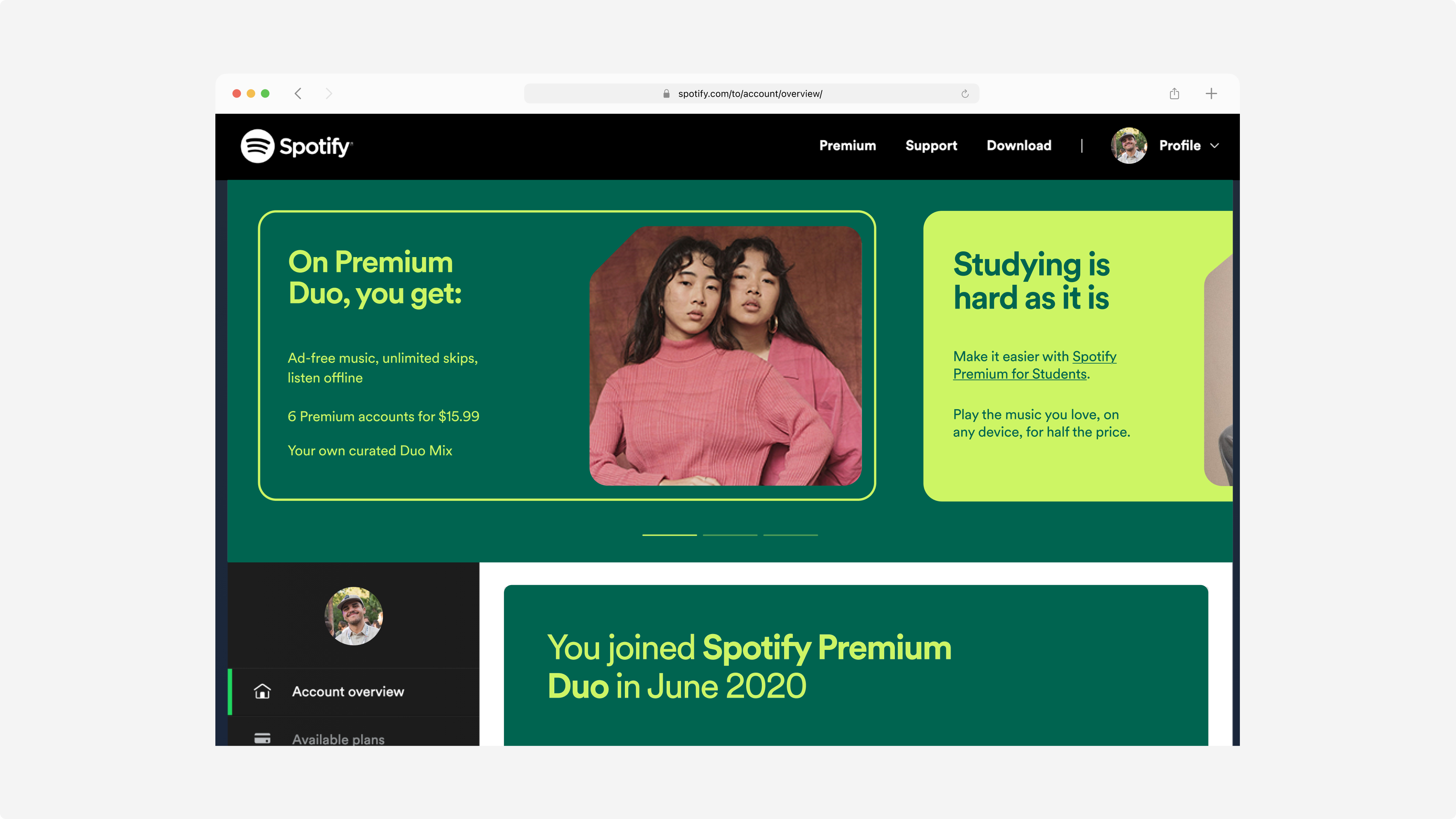
A tale of Zara Larsson, 24 million monthly unique visitors, and a lil’ Spotify ✨ magic ✨
“Account”? Isn’t that where I change my password?
Indeed. But you can do so much more. The spotify.com/accounts/overview page is where all your deepest darkest secrets, like your password and payment details, exist. It’s the fourth most commonly visited Spotify page.
At the time, a 2017 Zara Larsson had the honour of gracing the large header area also known as the jumbotron space. It was a very, very outdated space that deserved love and attention
At the time, a 2017 Zara Larsson had the honour of gracing the large header area also known as the jumbotron space. It was a very, very outdated space that deserved love and attention
Isn’t that where I would learn about my plan too?
You’d think so, but at the time it wasn’t. In general, most users across all plans don’t have a good understanding of the value that comes with their plan. This can be owed to several reasons, one of them being that Spotify was doing a bad job of having conversations with Premium users about their Premium value propositions.
Given that 24M users visit the page, 70% of which are Premium users, it serves both as an incredibly important purpose of utility for users but also a great opportunity to communicate the perks of Premium plans and serve as an inspirational storefront if you will.
What if the Account Overview space could be a familiar 🚪 for Premium users, where they get inspired, informed, rewarded and notified of their relationship with Spotify?
What do we already know?
We already sit on a lot of insights around churning, the role of the account page and what users value the most in their Spotify experience. Multi-plan managers (Spotify users who pay and manage plans that contain multiple users (e.g. Family and Duo) face the biggest pain-points around lack of awareness, but are also the group of users who present the biggest growth opportunity.
So I set out to cluster and synthesise all of our existing insights into four different buckets. And after an alignment workshop with some internal stakeholders on what I should leverage in terms of existing insights, and what problem areas to prioritise, I formulated this overarching hypothesis based on these opportunities:
So I set out to cluster and synthesise all of our existing insights into four different buckets. And after an alignment workshop with some internal stakeholders on what I should leverage in terms of existing insights, and what problem areas to prioritise, I formulated this overarching hypothesis based on these opportunities:

Laying down the ground work
Solutions are exciting. But before diving into that, let’s set out the foundations.
First on the menu: a quick audit of the existing account/overview page at the time, and what could be changed.
First on the menu: a quick audit of the existing account/overview page at the time, and what could be changed.

To help further guide me, I also defined some potential scenarios that multi-plan managers come across that stop them from realizing the value of their Premium plan, and created UX goals based on those scenarios:

Guiding principles, and going crazy 🔦
So how can we show the value of Premium in a way that is personal and fun early on?
To guide my concepts, I created and divided my guiding principles into two categories, including what they entai in practice:
The short-term category focuses more on Premium education and alerting and nudging users into taking the steps they need to take to fully enjoy their Premium plans. This means we need to:
The long-term, more blue-sky category focuses on personalization and the things that differentiate Spotify from other competitors, like this feeling of “Spotify knows me”. This category focuses more on the question of “what if the account overview page could be an overview of your relationship with Spotify?”
To guide my concepts, I created and divided my guiding principles into two categories, including what they entai in practice:
The short-term category focuses more on Premium education and alerting and nudging users into taking the steps they need to take to fully enjoy their Premium plans. This means we need to:
-
Be reliable: alert users to take immediate action through a clickable primary alert banner in the jumbotron that deeplinks them to the necessary action.
- Be helpful: nudge users into exploring other Premium benefits exploration (e.g. listening offline) and education (other plans).
The long-term, more blue-sky category focuses on personalization and the things that differentiate Spotify from other competitors, like this feeling of “Spotify knows me”. This category focuses more on the question of “what if the account overview page could be an overview of your relationship with Spotify?”
- Be personal: inform users of upcoming audio releases and news based on their listening history.
- Be inspiring: reward users with data of their own and their members’ listening behaviors; make them feel like Spotify knows them.

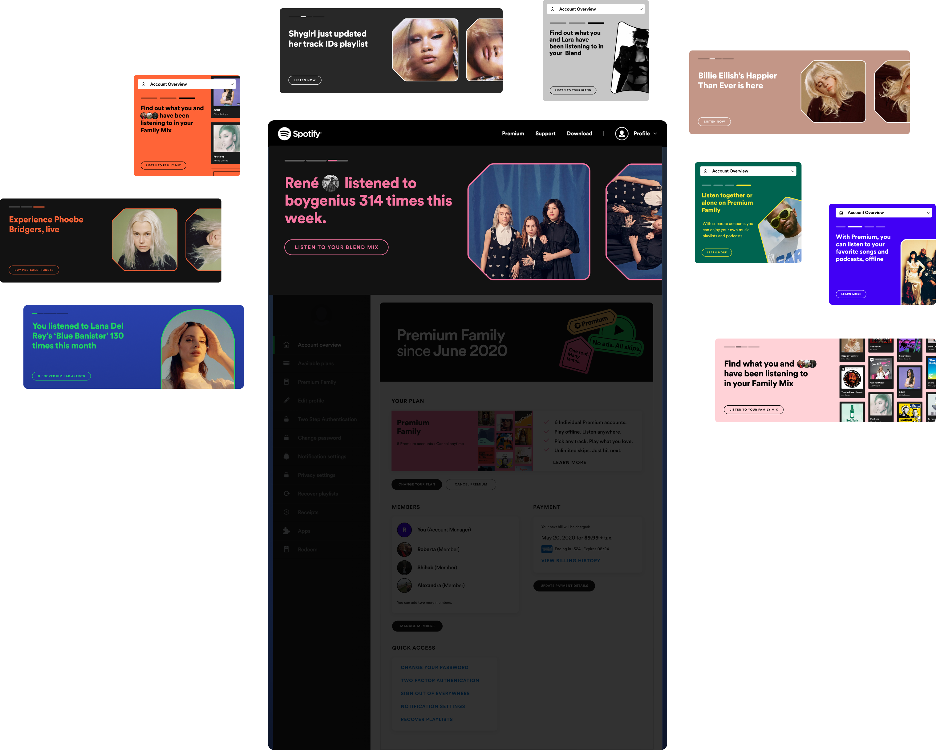
Now it was time to re-imagine the large jumbotron space, for both mobile and desktop.
I explored concepts that touch on both of these categories but ultimately tested the concepts within the short-term category with users, i.e. informing, nudging and alerting.
The concepts below focus mainly on the inform and reward principles as I wanted to establish the long-term visual identity and tone of voice of the jumbatron, and work backwards to accommodate for the short-term category.
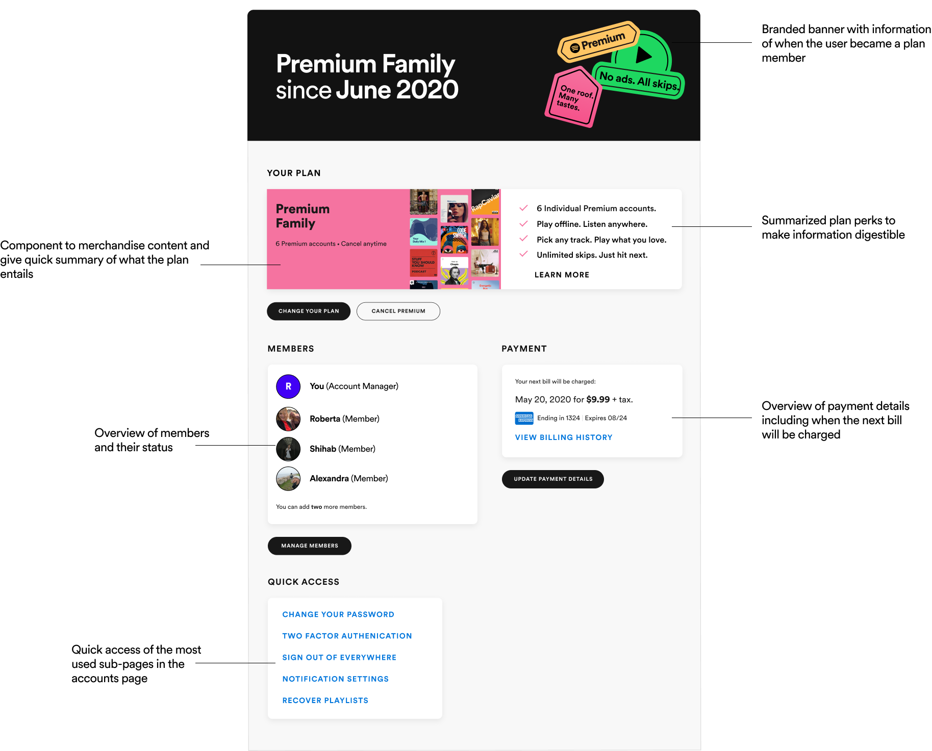
Last but not least, I explored how the “Your Plan” module could exist. After some iterations, and because it wasn’t the biggest priority in terms of development, I ended up just updating how and what we communicate (e.g. the plan benefits), and redefining some of the information architecture:
Testing, testing, testing!
Since mobile users accounted for the largest group of users who access the account overview page, I decided to carry out unmoderated usability tests of the mobile version of the new and existing (at the time) account overview page.
One group were shown a variant of the account page that had the new jumbotron, Your Plan card and dialog, and the other group were shown the control, as-is version of the account page. The aim was to explore how these two groups carried out the task of adding a shared address, and to get their overall impression on the account page and what it’s communicating (including the jumbotron and new Your plan card).
I also had the following testing hypotheses to form the basis of my research objectives and questions:
- If we inform primary account managers that they haven't yet added a shared address to their plan using a dialog on the account page, they will more easily add a shared address and are more likely to invite members accounts to their plan.
- If we educate users about the benefits of their plan, using the jumbotron, they will discover more value in their Premium plan and understand what it entails.
Variant A
![]()
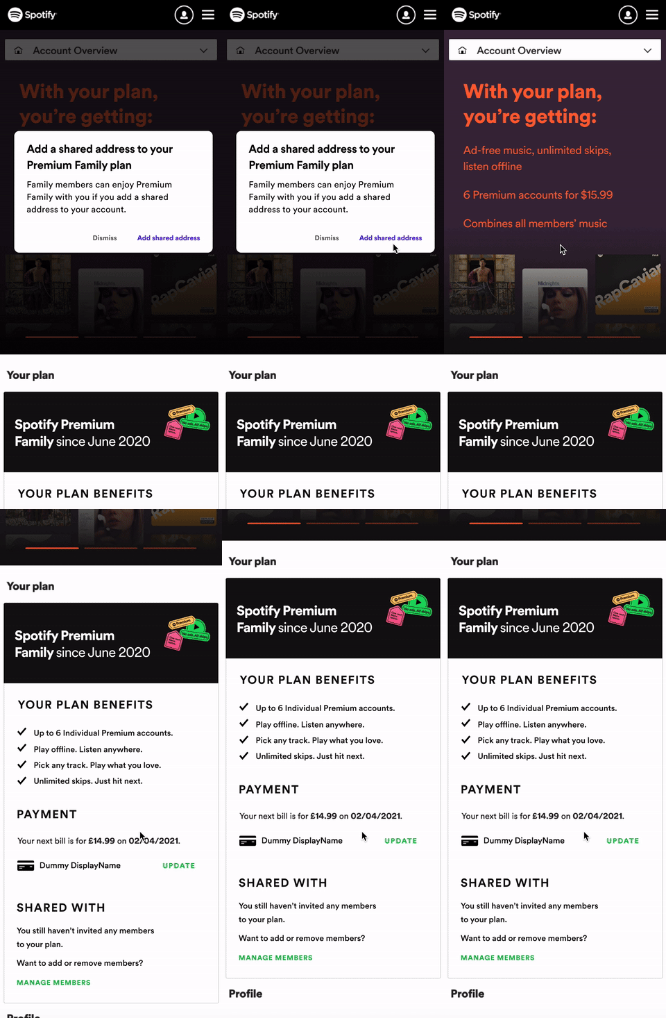
Control
![]()
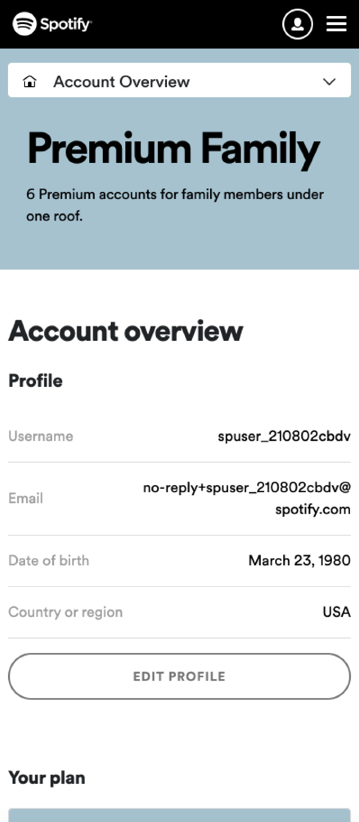
Both the testing hypotheses were confirmed: adding an address was easier, and multi-plan managers had a better understanding of their plan.
The alert dialog worked really well in the usability testing. Participants felt like it was simple and straightforward, and gave them the feedback and reassurance that they had completed or needed to complete an action.
Finally, a surprising finding to me was that participants actually placed a lot of importance on the Your Plan module that’s in the account overview page. So participants in the variant group reported that the Your Plan module was informative and contextual, and that it gave them a better understanding of the benefits that come with their plan and also the sort of state of their plan (who’s in their plan for example). On the other hand, the participants in the control group missed the Your Plan module.
Putting it all together
I finally templatized and defined some parameters, including the fact that the jumbotron shouldn’t be full-bleed but instead expose the top part of the ‘Your Plan’ module on mobile to remind users that they’re still on the account page and not somewhere else.
For implementation purposes, since we’re tackling the short-term opportunity first, I decided to use the visual language but more generic imagery to maintain the editorial and personal feel of the Account Overview page.
For implementation purposes, since we’re tackling the short-term opportunity first, I decided to use the visual language but more generic imagery to maintain the editorial and personal feel of the Account Overview page.

Account Overview on desktop web, across all paid and Free plans:
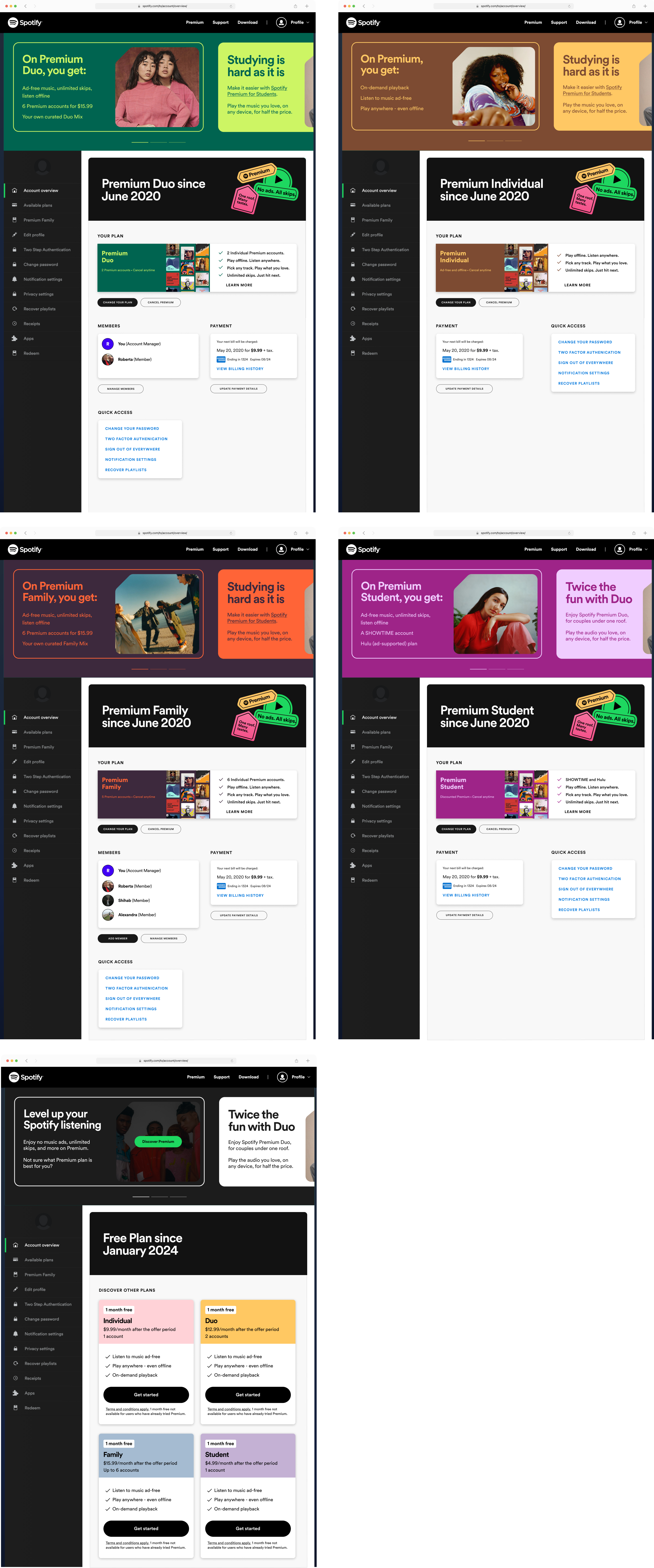
Account Overview on mobile web, across all paid and Free plans:

Reflections!
Getting to establish a strategy for such an important surface, and needing to balance the functional, utility needs of an accounts page with its aspirational potential was a fun challenge. I’m really glad seeing some of my ideas being in production and further tested by the team that took over this.
Spotify: Account Overview
Reducing churn through Premium education
Transforming the Accounts Overview hub for 24 million unique visitors, and educating them about the value that comes with their plan.
︎ Read more
Transforming the Accounts Overview hub for 24 million unique visitors, and educating them about the value that comes with their plan.
︎ Read more
